Hidden in Plain Sight: The Hidden Messages in NBA Logos
In an era where NBA logos are increasingly criticized for shifting toward a standardized, circular aesthetic, it is easy to overlook the intricate storytelling still embedded within these marks. While the "Roundel Revolution" has simplified many primary logos, several franchises have fought back against "sanitization" by hiding clever symbols and initials in plain sight.
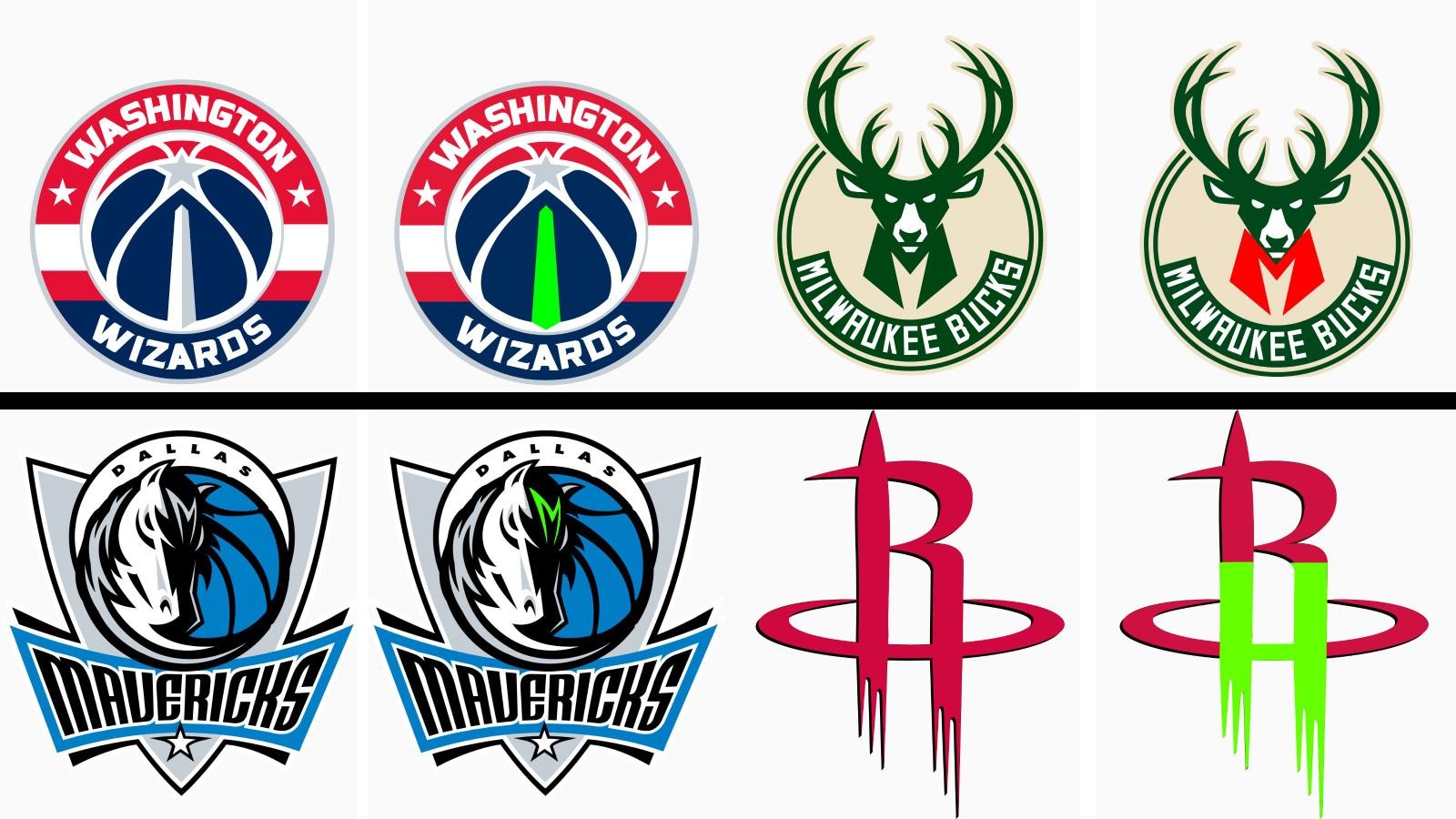
1. The Washington Wizards: The Monument
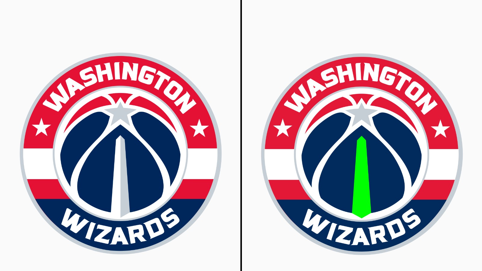
The Wizards' primary logo features a basketball that serves as a canvas for the city's most iconic landmark. If you look at the white-grey negative space in the center of the ball, it forms the silhouette of the Washington Monument. It is a brilliant way to anchor the team to the nation's capital without needing a literal drawing of the city skyline.

2. The Dallas Mavericks: The Forehead "M"
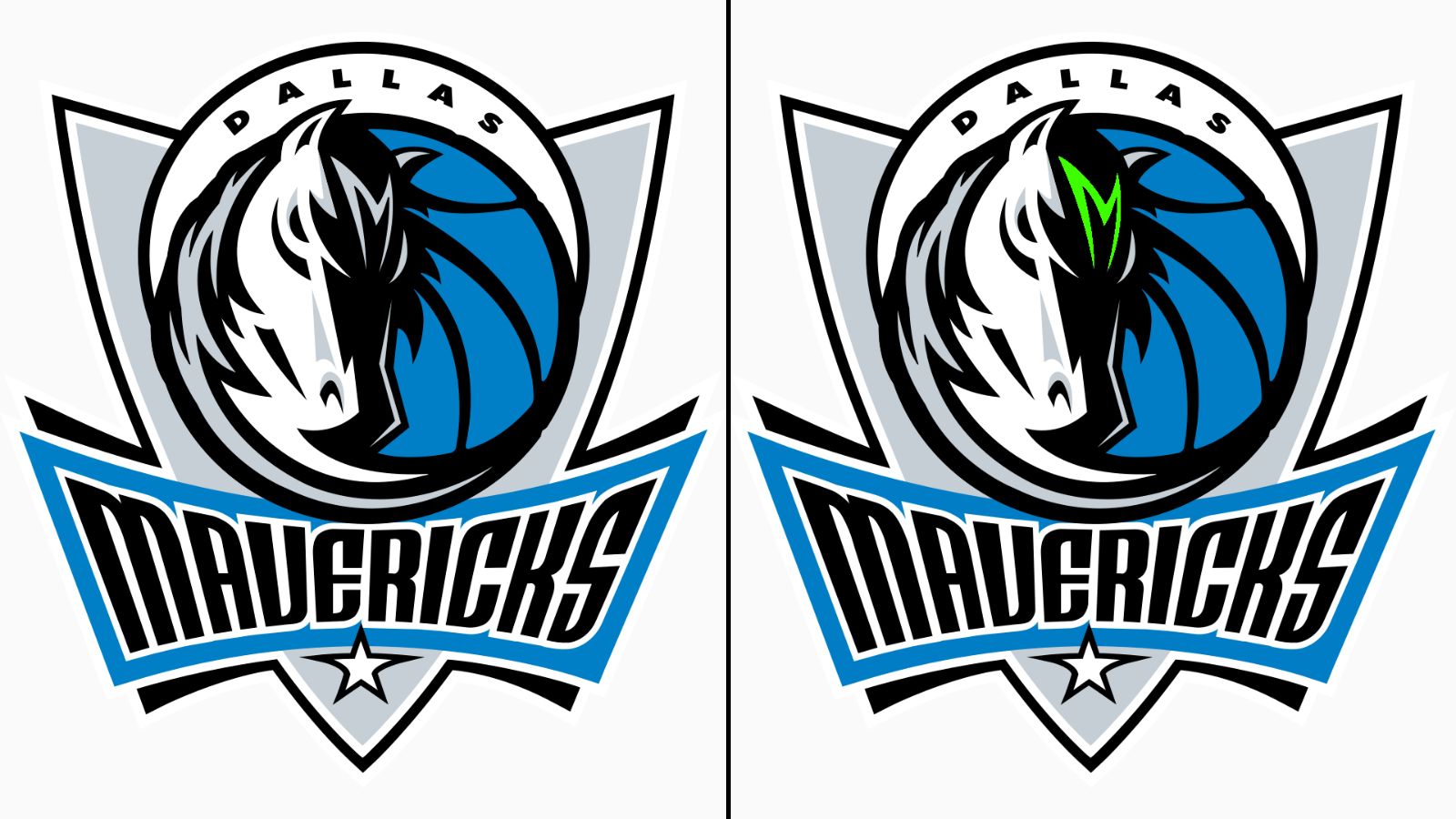
The Mavericks’ stallion is one of the more detailed marks in the league, but it contains a subtle geometric secret. On the horse's forehead, the shading and highlights are meticulously arranged to form a stylized "M". This ensures the city’s identity is literally "on the mind" of the mascot at all times.
3. The Milwaukee Bucks: The "M" in the Neck
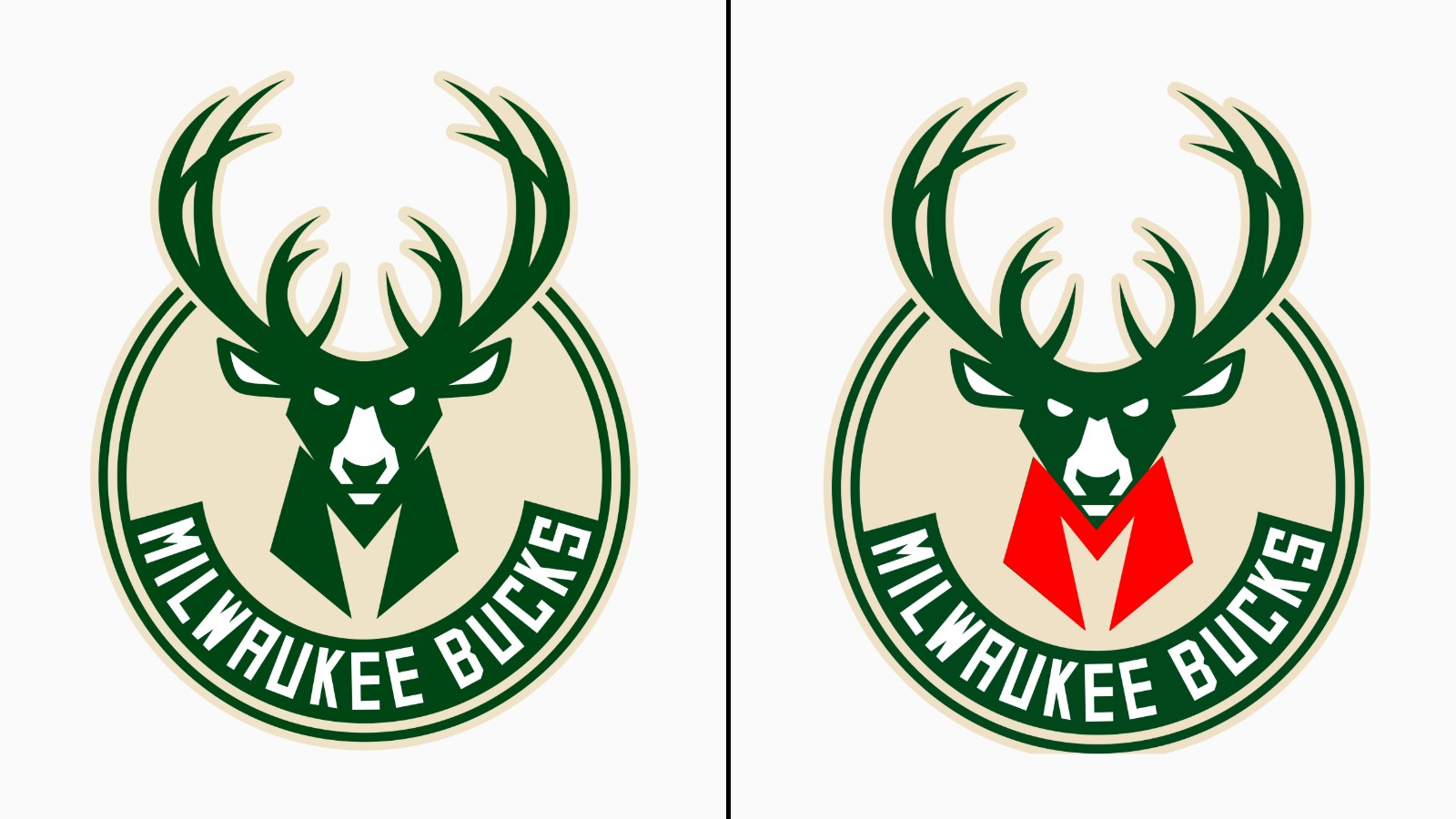
The 2015 Bucks rebrand is a masterclass in modernizing a mascot while retaining "silhouette value". If you look at the green space undernetah the buck’s head and above its chest, the shape forms a sharp "M" for Milwaukee.
4. The Milwaukee Bucks: The "Hidden Ball"
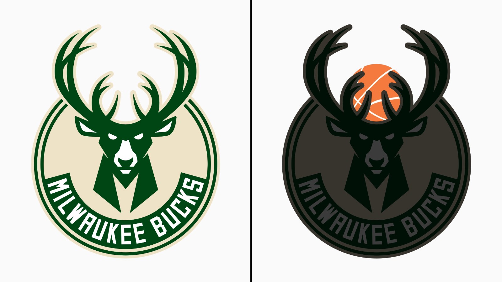
Additionally for the Bucks, the inner edges of the antlers are meticulously curved to form the seams of a basketball, ensuring the sport is represented even in a mascot-heavy mark.
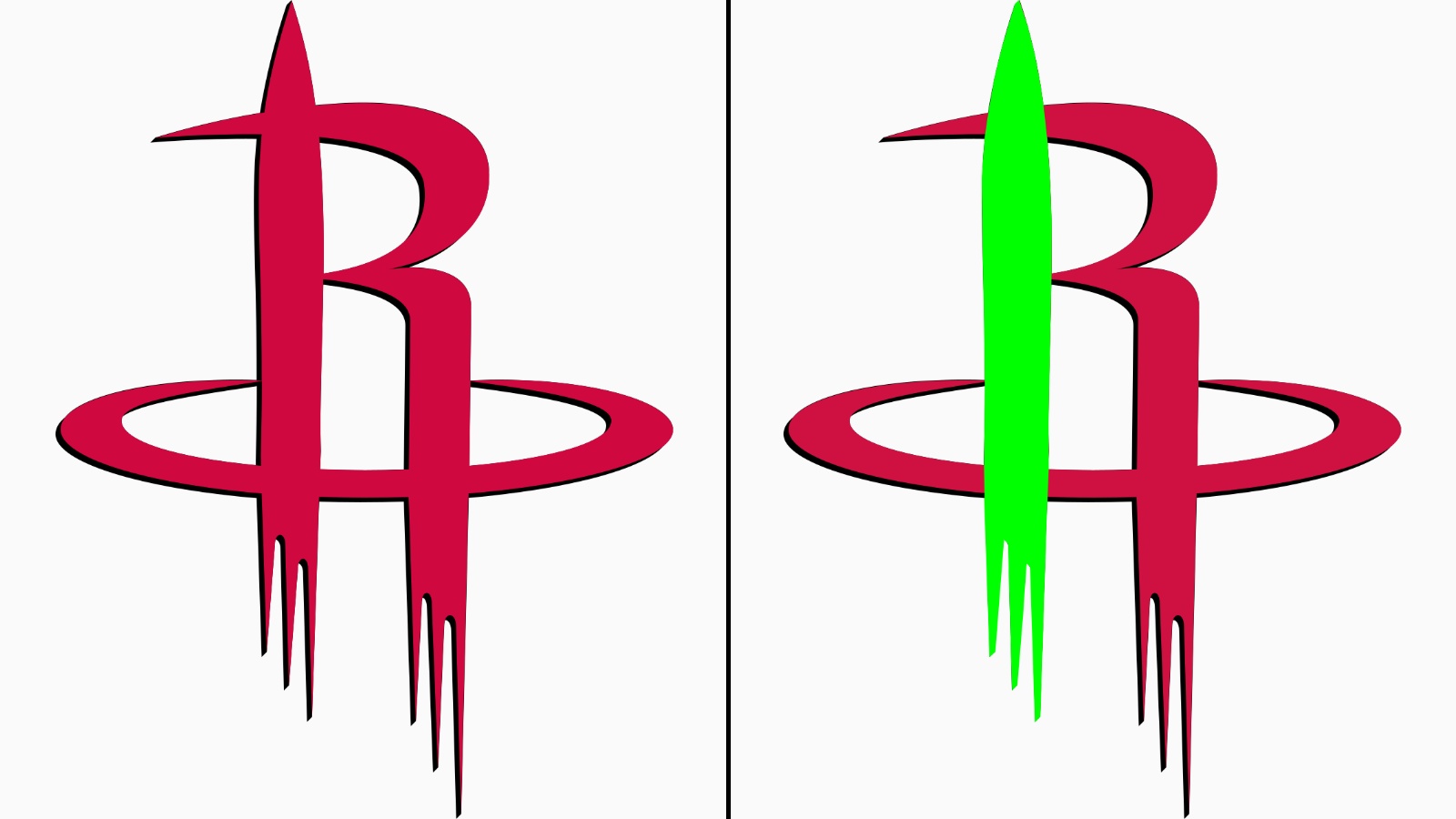
5. The Houston Rockets: The "H" within the "R"
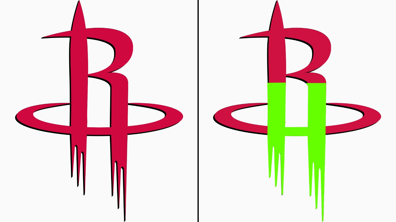
The Rockets' current logo is often seen as a simple, sleek "R" shaped like a rocket taking off. However, it packs a deceptive amount of information into a minimalist frame. The crossbar of the "R" and the vertical struts are designed so that the negative space also forms a clear "H" for Houston. It’s a dual-lettermark that represents both the team name and its home city simultaneously.
6. The Houston Rockets: The "Rocket" within the "R"
The primary "R" is stylized as a rocket ship blasting off from a circular landing pad.