MISE À JOUR : La Fédération vietnamienne de basket dévoile son nouveau logo
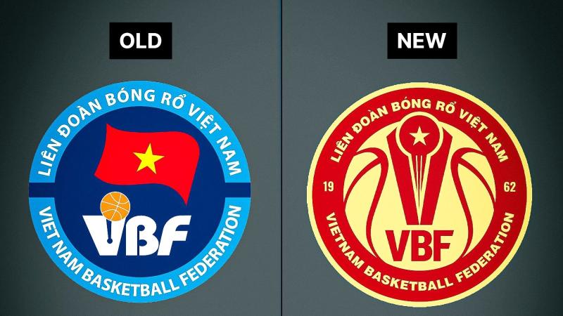
The Vietnam Basketball Federation (VBF) has officially unveiled a new logo, marking a significant visual rebranding for the organization. The new emblem replaces the federation's previous logo with a more modern and symbolic design.
Vietnam Basketball Federation New Logo
The new logo adopts a dynamic red and gold color palette. The design is built around the shape of a basketball and incorporates three main symbols: a golden star representing the national spirit, two abstract hands holding the ball to symbolize community, and the "VBF" acronym at the bottom. The federation's founding year, "19" and "62," is split on either side of the central graphic, and the full name in both languages still frames the emblem. This new logo was designed by Thái Bình Dương, the winner of a design competition held by the federation, and will be used across all official VBF activities and by the national teams.
Comparison:
The new Vietnam Basketball Federation logo is a significant upgrade, moving from a somewhat generic and outdated design to a much more modern and one with more identity. Its clever integration of national and basketball-specific symbols, such as the star and the hands forming a ball, creates a more dynamic and professional look compared to the old logo's flag-based emblem. Overall, the updated red and gold color scheme and sleek design provide a stronger and more memorable brand for the future of Vietnamese basketball.


