Die Revolution der Rundlogos: Wie die NBA immer einheitlicher wird
In the visual history of the NBA, logos were once as varied and electric as the players themselves. From the jagged, futuristic brushstrokes of the 1990s to the free-standing animal mascots of the 2000s, a team's primary mark was defined by its unique silhouette. However, over the last decade, a quiet but rigid standardization has reshaped the league's aesthetic landscape. This was recently highlighted by @ZachCohenFB on X.
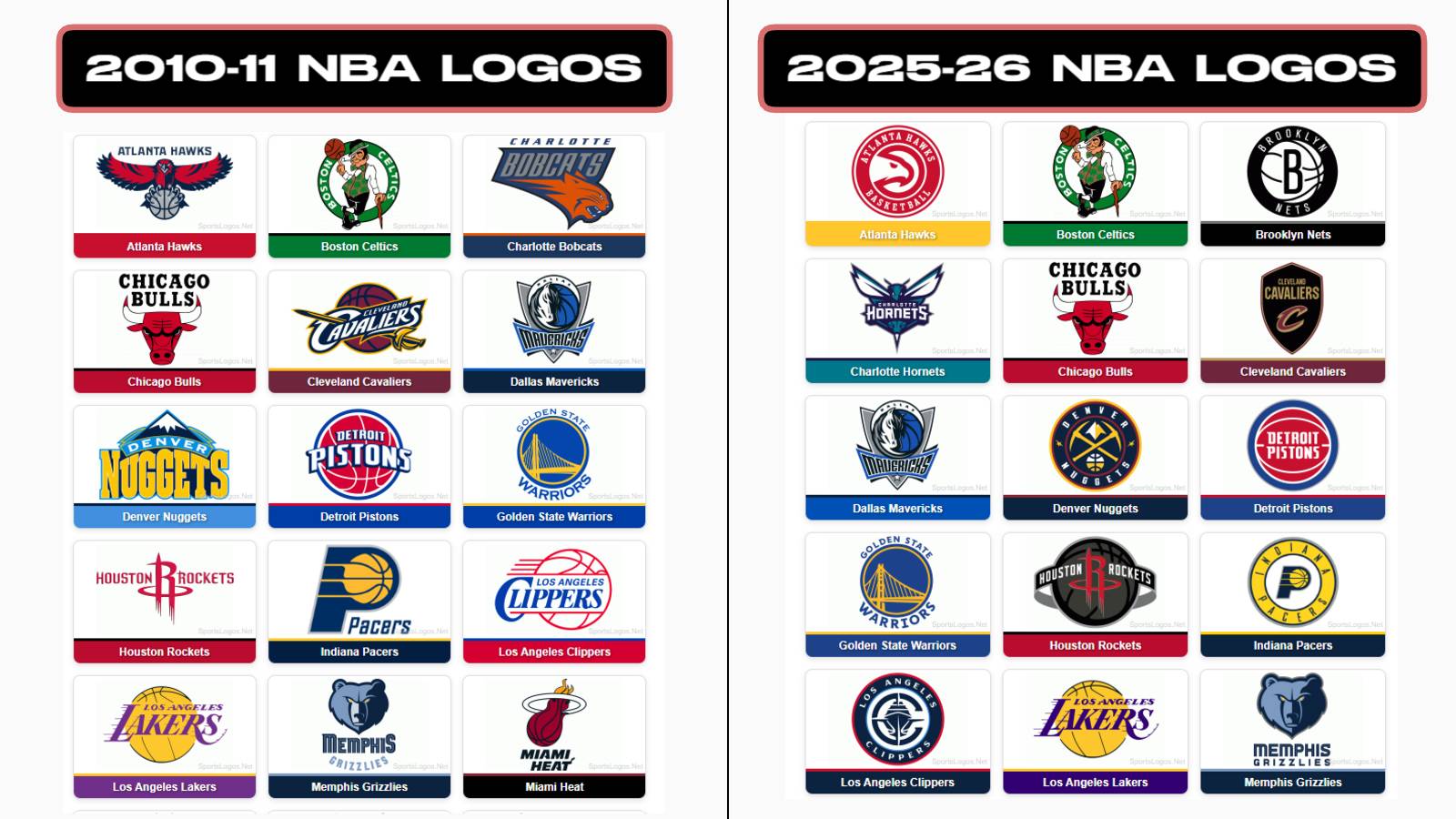
The Data of Standardization: 2010 vs. 2025
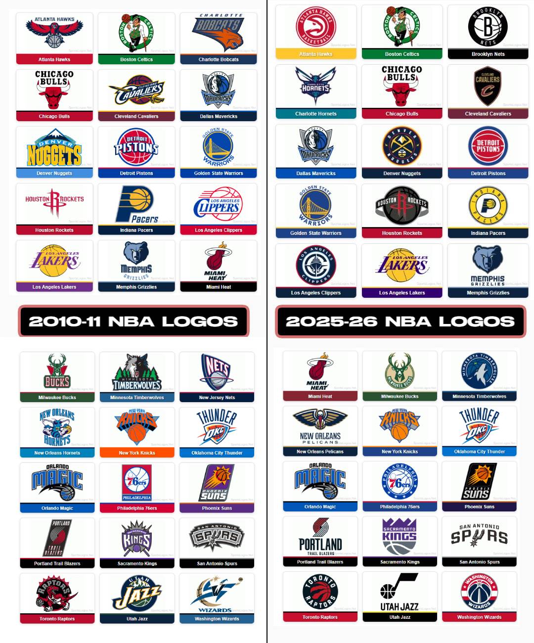
photo by sportslogos.net
The shift toward circular "roundel" logos - marks consisting of a central icon enclosed by a circular border containing the team’s name - is not just a trend; it is a league-wide directive.
-
In 2010: Only five NBA teams utilized a circular or semi-circular primary logo (the Lakers, Celtics, 76ers, Pistons, and Pacers).
-
In 2025: That number has surged to 16 primary marks, representing over half the league.
Franchises like the Milwaukee Bucks, Minnesota Timberwolves, and Denver Nuggets have all transitioned from unique, irregularly shaped identities to the standardized circular format during recent rebrands.
I can’t be the only one disappointed by the lack of recent creativity with NBA logos, right?
— Zach Cohen (@ZachCohenFB) December 19, 2025
Primary NBA logos in 2025:
- 16 are circular or semi-circular
Primary NBA logos in 2010:
- 5 are circular or semi-circular https://t.co/9WKHASOKrP pic.twitter.com/RYGEhsEzNp
This transition is driven by a strategy often referred to in league offices as the "Global Logo." According to Christopher Arena, the NBA’s Vice President for Identity and Brand Identity, the goal is to create marks that are instantly recognizable in any market, regardless of language. To achieve this, the league "encourages" (aka requires) that primary logos include a basketball to immediately identify the product.
Furthermore, the rise of the circular logo is a response to the "app icon" economy. In a digital-first world, a logo must be legible as a tiny 50x50 pixel favicon or a social media avatar. A circular "roundel" is the most efficient shape for these digital containers, ensuring the team name and icon remain centered and symmetrical on every screen.
Design critics and historians, most notably those from the late Uni-Watch, have long critiqued this "sanitization" of sports design. Paul Lukas famously coined the term "The Great Circle Jerk" to describe the phenomenon of teams being funneled into a single, corporate design template.
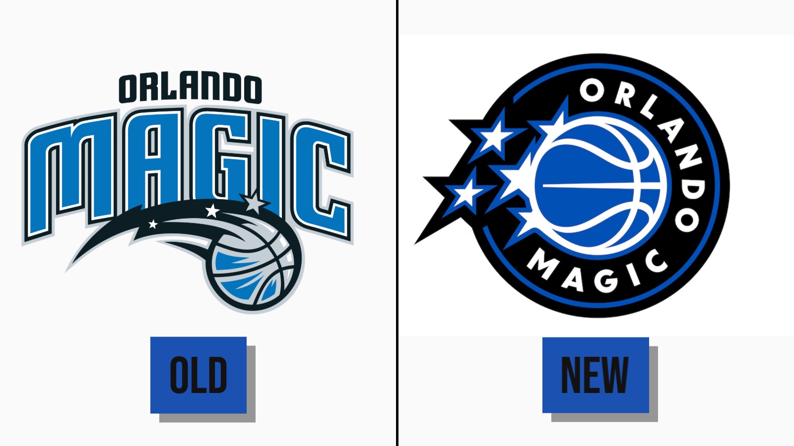
example of the new Orlando Magic logo earlier this year
The primary victim of this shift is silhouette value. In previous eras, you could distinguish the Rockets' logo from the Timberwolves' logo by their outlines alone. Today, if you were to view the silhouettes of 16 different primary logos, they would appear as identical circles. This loss of distinctiveness trades local franchise heritage for corporate scalability, resulting in a league where team identities feel more like interchangeable "coasters" than unique civic symbols.
Our Opinion:
While the NBA has successfully streamlined its brand for a global, digital audience, it has done so at the cost of visual diversity. As more teams adopt the circular mandate, the "Global Logo" risks becoming a generic one, stripping the league of the vibrant, varied aesthetic that once made its team identities so iconic.